Contents
Wherever you are on your digital transformation journey, data visualisation makes it easy to optimise operations.
Big Data – shorthand for the billions of transactions datasets generated daily – is key in industry, but simply collecting reams and reams of counts and figures isn’t enough. The data must of course be accurate and relevant. Moreover, it’s vital that it can be analysed in the right way to enable businesses to make the best data-driven decisions.
The actionable insights are already there, contained in the data. Data visualisation – viewing information in clear graphical forms – takes the guesswork out of analysing big data by cutting out the noise and making it easier to spot trends, patterns and unusual values (outliers.) Often complex statistical analysis isn’t required; simple data visualisation allows humans to understand the big picture unclouded by individual data points.
Data visualisation can gather data from different sources and show it graphically in one place, making it easier to identify organisational opportunities, shine a spotlight on inefficiencies, and help solve other common challenges on the factory floor.
1. Reduce costly errors
To err is human; the ability to spot inevitable mistakes in real-time and respond quickly can make a huge difference.
Using data visualisation to show data from varied sources on a centralised visual dashboard allows supervisors to see everything at a glance (shift productivity, machine downtime, outputs, etc.), making it easier to keep track of every part of the manufacturing process and action fast responses.
2. Streamline the supply chain
Data visualisation means you can take data at any given time, and compare it against historical performance data. With historic data visualisation, it’s easier to track ROI and delivery rates, identify where resources are allocated, and manage Overall Equipment Effectiveness to optimise supply chain efficiency.
3. Balance quality control with cost-cutting
A visual data model makes it easy to see where resources are spent and proactively identify potential flaws; ensuring that all processes are designed to meet quality assurance standards in the most cost-effective way. Quality doesn’t always have to come at a price; some of the largest quality gains can be made by simple changes highlighted by data visualisation.
4. Identify & eliminate inefficiencies
Enterprise Resource Planning (ERP) is the measurement and management of critical processes, often in real time. Data visualisation lets you discover datasets related to resources, materials, productivity, and shift performance in a comprehensive database. This will enhance ERP, allowing decisions to be made more rapidly and with fewer errors.
5. Data visualisation with free open-source software
Even without the facilities to capture data, it’s possible to prove concepts without wiring sensors, by using free-to-start, open-source software (InfluxDB and Grafana) and Brainboxes BB-400 Industrial Edge Controller.
In industry, it’s common to count how often something changes, store the information, and then review and analyse the information in a graph. For example temperature, parts counts, or machine errors. Node-RED can be used to send data to InfluxDB which can then be visualised in Grafana.
Watch the video above for an easy-to-follow tutorial, that will walk you through sending data from an edge controller to a database in InfluxDB and how to produce graphical visualisations of the data. Read More
-
BB-400
$592.52 Add to cart
Try Our Product Evaluation Scheme
Industrial Energy Monitoring: A Data Visualisation Case Study
Why energy monitoring?
Whilst globally, governments and businesses are already committed to steep decarbonisation targets, reducing power consumption is also increasingly a critical factor in achieving business-wide cost-saving. By efficiently capturing, aggregating and analysing your facility’s power data, you can get a clearer picture of energy as a raw material cost, helping to secure total buy-in from associates and conquer Net-Zero scepticism for your bottom line.
Retrofitting energy monitoring devices
The first step in understanding energy costs is to monitor power consumption, simply achieved by retrofitting energy monitoring devices into the existing production environment.
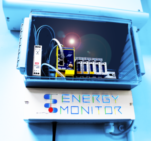
Distribution boards take electricity from the main supply to distribute safely to circuits throughout your facility. Installing sub-meters at these electrical distribution boxes allows the monitoring of electrical signals – every time a kWh of usage is recorded, the tally count on the sub-meter increases.
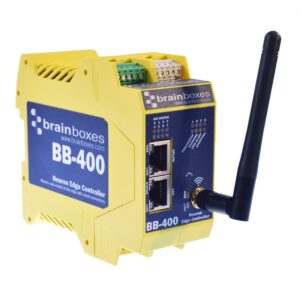
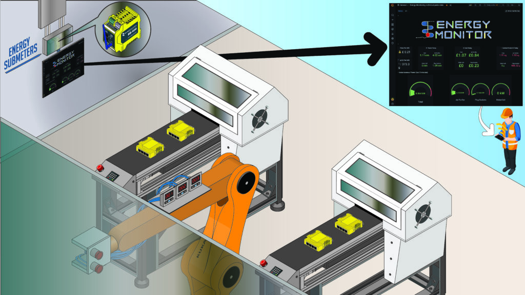
Adding a BB-400 Industrial Edge Controller to the distribution panel allows you to not only monitor the power consumption of individual areas, machines and processes but also capture timestamps and record historical usage data. As each unit of energy is added to the sub meters’ tally, an electrical signal is sent to the BB-400 via its IO lines, which it then converts into digital data
Data visualisation dashboard
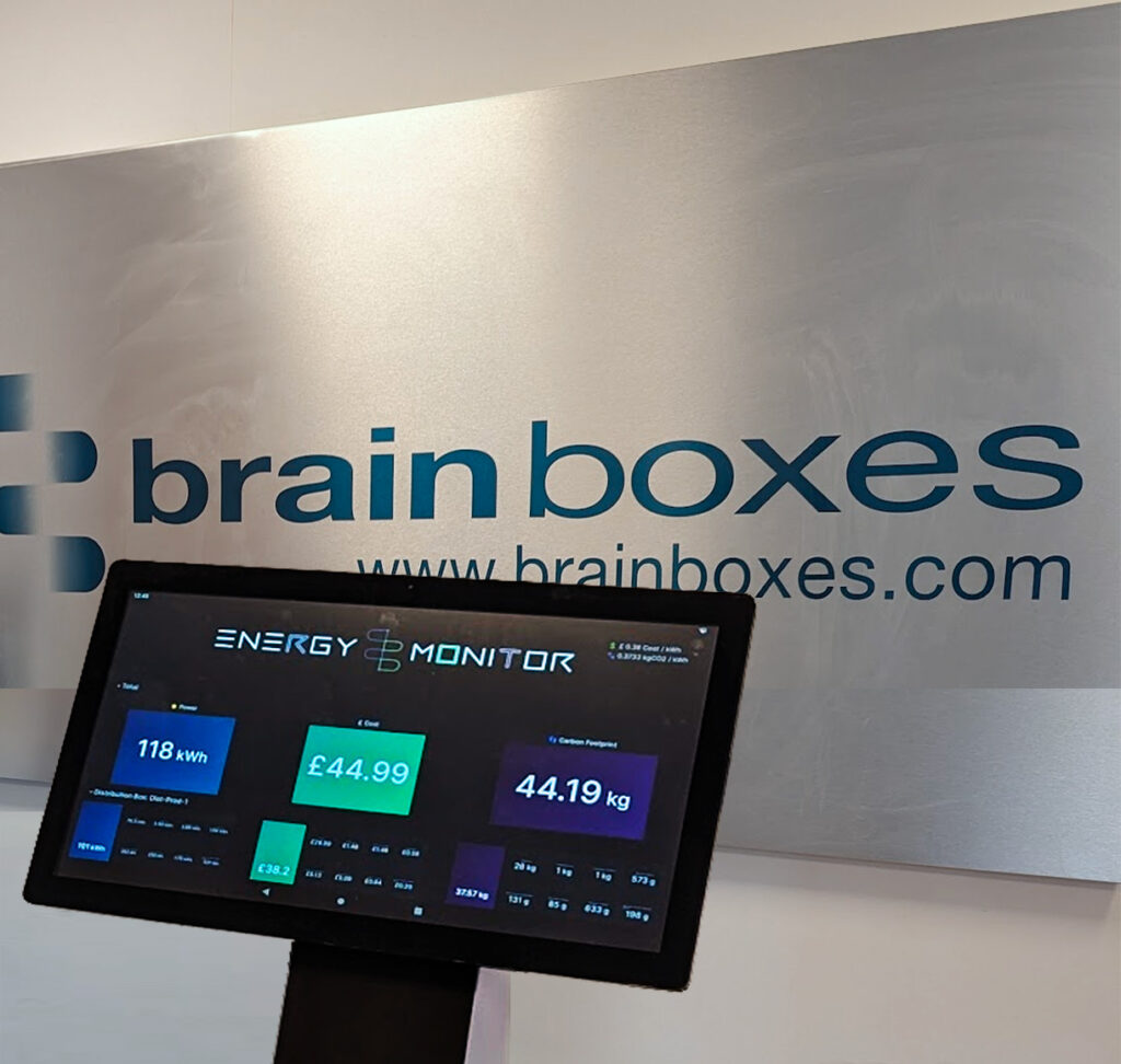
The actionable insights are already there, contained in the data which the smart controller stores in a database using free-to-start, open-source software such as InfluxDB. Complex statistical analysis isn’t required as all the detailed information on units of power consumed, cost (both per kWh and total) and carbon footprint is clearly presented on a centralised Energy Monitoring visual dashboard using another open-source platform: Grafana.
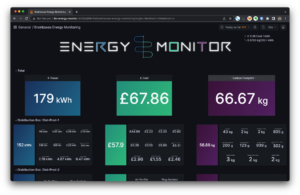
By installing remote IO devices to monitor additional sub-meters, data on every area of your facility, every breaker in your distribution panel, and every single kWh of energy usage can be linked and sent over the network to the BB-400 Edge Controller.
This plant-wide energy monitoring data is then aggregated by the BB-400 and can be sent into the cloud or integrated into your existing factory monitoring system. Customising the dashboard for your specific needs, decarbonisation goals, and cost-saving targets allows even deeper, individualised analysis.
By simply capturing and analysing accurate energy data using Brainboxes hardware and open-source software tools, you can start delivering the intelligent actions needed to increase positive brand perception, reduce the impact of market volatility on your production costs and achieve substantial financial savings.
Your Smart Energy Monitoring Starter Kit
¹ Reuters

